01 — Context
A month. Four people. A hard deadline.
In early 2025, Storable's marine division launched an internal initiative with a tight brief: design and ship a revenue-generating product feature within a month. The team was a pod of four — one PM, two engineers, and me. No extended discovery phase, no lengthy alignment process.
The constraint was clarifying. With a month on the clock, every decision had to be defensible quickly. That meant being deliberate about what to build before touching any design tooling at all.
02 — The strategic decision
Why launch and retrieval — and why it mattered that we chose carefully.
The PM and I started with a shortlist of three roadmap candidates that could feasibly be built within the timeline. Only one had a clear path to generating new revenue: a task management module for Molo, which had no equivalent feature in the platform.
The broader vision for task management was ambitious — a fully configurable system where marina operators could define any task type, make it customer-facing or internal, and manage it through a unified queue. But the MVP didn't need to deliver all of that. It needed to deliver enough to be worth paying for.
We narrowed to two task types: launch and retrieval. Putting a boat in the water, and taking it out again. These are among the most operationally significant requests a marina handles, they're time-sensitive, and they were already being managed by a competitor — SpeedyDock — whose launch/retrieval feature a Molo customer was actively using.
That competitive context shaped how we thought about scope. SpeedyDock had launch/retrieval and nothing else. Our MVP would match them on that specific flow, but built on an architecture flexible enough to support any task type as the module grew. We weren't just building a feature — we were building a foundation.
03 — Three surfaces
Two users. Three distinct product touchpoints.
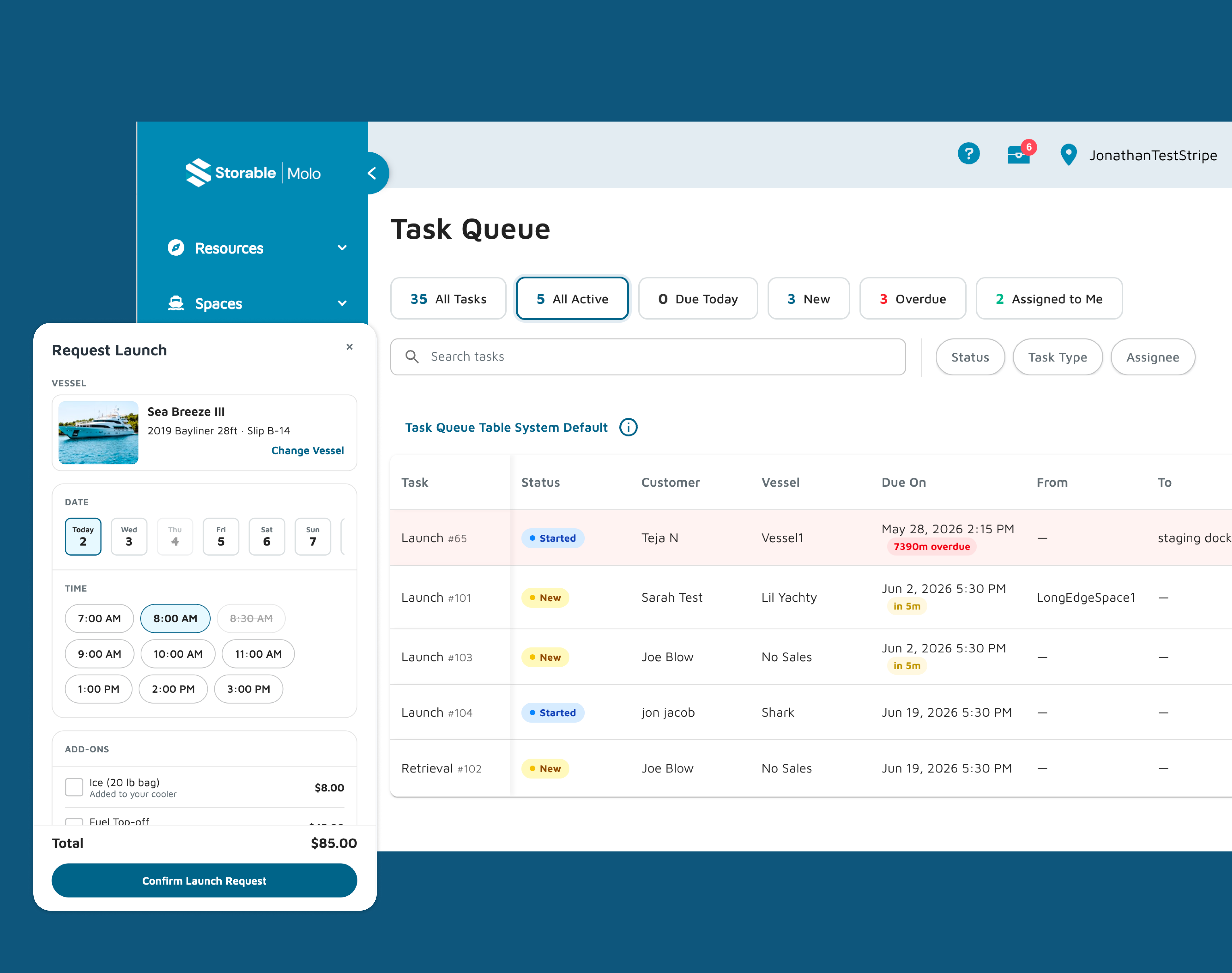
Once the scope was set, the product surface became clear. The feature needed to work for two distinct users: the marina customer requesting a task, and the marina operator fulfilling it.
Customer request formA customer-facing interface, accessible through Molo's customer portal, where boaters could request a launch or retrieval, specify their vessel, and choose a time.
Operator task queueThe operator-facing hub where incoming requests appear, operators manage task status, and staff can create tasks directly without a customer request.
Task settings pageMarina-level configuration for task types, operating schedules, and the resources available to fulfill tasks. The settings page is what makes the whole system configurable rather than hardcoded.
04 — The process
This is where the project diverged from how I'd typically work.
Rather than moving from brief to research to wireframes to Figma, the PM and I fed a project brief and a customer transcript directly into Claude and used it as a thought partner to rapidly spec the feature. The output wasn't documentation — it was a rough interactive prototype we used to pressure-test the feature set and identify gaps before a single component was designed.
From there, I used Claude Code exclusively to build three fully interactive HTML prototypes — one for each touchpoint. These weren't low-fidelity wireframes. They were pixel-precise, fully styled using Molo's design system, responsive, and interactive enough that engineers could use them almost directly in lieu of Figma handoff files. The developers said it was genuinely smoother than a traditional Figma-to-dev workflow.
I had working prototypes for all three flows in two weeks. The two-week turnaround speaks for itself.
One friction point worth noting: importing Molo's design system components into Claude was cumbersome at first. Copying components via the Figma MCP server every time I started a new file wasn't sustainable. So I built a reusable design system repository — a structured markdown file containing component specs, tokens, and patterns that I could feed into Claude at the start of any new prototype. A limitation of the process turned into a process improvement.
05 — Customer portal
The boater's side — simple by design.
The customer portal needed to be frictionless. A boater requesting a launch shouldn't need to understand how the marina operates. They need to specify their vessel, pick a time, and submit. The progress stepper surfaces active request status so they're never left wondering what's happening. And when a boat is already in the water, a contextual retrieval prompt appears automatically — no hunting through menus.
The mobile view was a priority from the start. Boaters are on the dock, not at a desk.
06 — Operator queue
The operator's side — clarity under pressure.
The task queue is where the operational complexity lives. Operators need to see incoming requests, understand what's urgent, update task status as work progresses, and create tasks directly when a customer calls in rather than submitting through the portal. The collapsible sidebar keeps the queue surface area clean. Status management is immediate and visible.
This is the screen operators praised most in feedback. That's not a coincidence — it's the surface where poor information architecture would have the most operational cost.
07 — Task settings
The configuration layer that makes the whole system flexible.
Task settings is the least visible surface and the most architecturally important one. Without a well-designed configuration layer, the system would be hardcoded to launch and retrieval forever. With it, any task type can be defined, scheduled, and resourced without touching the codebase. Operating schedules, capacity controls, blackout dates, resource assignment — all configurable by marina staff, not developers.
08 — Validation
The right kind of feedback.
Before handoff, we showed the prototypes to the marina operator who had been using SpeedyDock. Their feedback was the most meaningful benchmark available — a user who knew exactly what the competitive standard looked like, and who had real operational complexity behind every question they asked.
Rather than pointing to missing features, the operator engaged with the design seriously enough to send a detailed, structured requirements document afterward — covering everything from role-based permissions and concurrent mobile usage to billing integration, read-only display modes for dock monitors, and historical analytics.
Nearly everything they asked for in terms of configurability — operating schedules, capacity controls, blackout dates, task resource assignment — was already accounted for in the task settings design. The architecture had anticipated their needs without having been told about them explicitly.
The gap between what we'd built and what they described wasn't a sign the MVP had missed the mark. It was a sign it had been credible enough to make a sophisticated operator think seriously about what they'd actually need to run their marina on it. That's a different kind of validation than "it looks good." It means the foundation is right.
09 — Reflection
A month is a forcing function.
It eliminates optionality and forces prioritization in a way that longer timelines rarely do. In this case, that constraint produced something genuinely good — a focused, well-scoped feature that solves a real operational problem without overreaching.
The AI-assisted process deserves honest assessment
Using Claude Code to prototype directly — rather than designing in Figma and handing off — compressed the timeline significantly and produced artifacts that were more useful to engineers than static design files. That's not a workflow I'd apply to every project. For a complex system redesign with many stakeholders, Figma's collaboration and annotation capabilities matter. But for a fast, focused pod working toward a hard deadline, it was the right tool.
What I'd do differently
The competitive analysis of SpeedyDock was informal. A more structured teardown earlier in the process might have surfaced edge cases we'll likely encounter as the module expands beyond launch and retrieval. That's work that still needs to happen.
What I'm proud of
The design system repository. A problem I hit on day three of prototyping became a reusable asset for future projects. That's the kind of thing that compounds — a small investment in process that pays back on every subsequent project that uses it.